


You know that feeling when you walk into a room and everything just works? The textures talk to each other and the light hits juuuust right. It’s this specific combination of elevated and comfortable that’s really, REALLY hard to pull off.
That’s what Emily, the founder of Maple and Loft, creates for her interior decorating clients in New York City. When it came time to build her brand, we wanted to capture that exact energy, which was a brand (and a set of brand photos) that felt as considered and welcoming as the spaces she designs.
This project was a full brand identity design paired with a curated branding photoshoot, and I want to walk you through both processes. I am so confident that this is one of the best examples I have of what happens when strategy and imagery are built as one cohesive thing, instead of two separate checklists by two separate people.
The Brand Identity: Elevated, Comfortable, and Very Intentionally Both
Emily came to me with a clear sense of who she is as a designer, but the visual identity hadn’t been created yet. We know that her work wasn’t about cold minimalism or unattainable luxury, and her whole approach is rooted in making beautiful, complete design accessible through thoughtful, cost-effective solutions. She is the kind of designer who wants your home to feel like yours, not just like a showroom you’re afraid to sit in.
So when we started building the brand strategy, we kept coming back to six words: elevated, comfortable, attainable, curated, functional, grounded.
Those words became a filter for every decision that followed.
The color palette pulls from the warmth of the interiors Emily gravitates toward in her apartment! This consists of dark browns, olive, a sandy neutral, charcoal, and a rich tile color that anchors the whole system. There are many earth tones without it feeling rustic or heavy. It ended up reflecting like the kind of palette that feels like a room you’d actually want to spend time in.

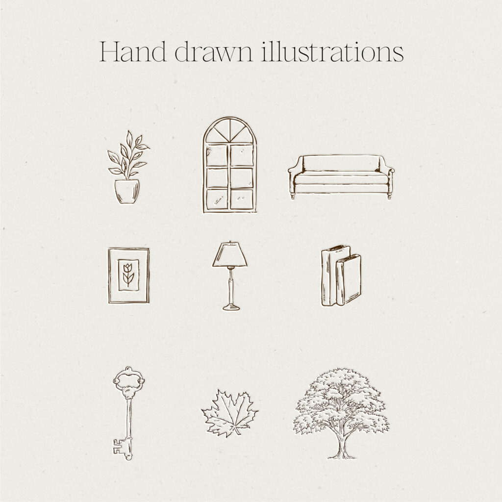
One of my favorite parts of this brand is the hand-drawn icons! Emily’s work is deeply tactile (she is someone who reaches for fabric swatches and paint fans before she ever opens a screen), so we incorporated these custom illustrations throughout her brand: a key, a window, an olive branch pattern. These little details do so much heavy lifting. They communicate warmth and craft in a way that a logo mark alone never could. This is why I become SO passionate about full brand kits – because, yes, your primary & alternative logos are so valuable on their own, but the addition of hand drawn icons, patterns, and logo marks truly help prop your brand up and make it more recognizable.
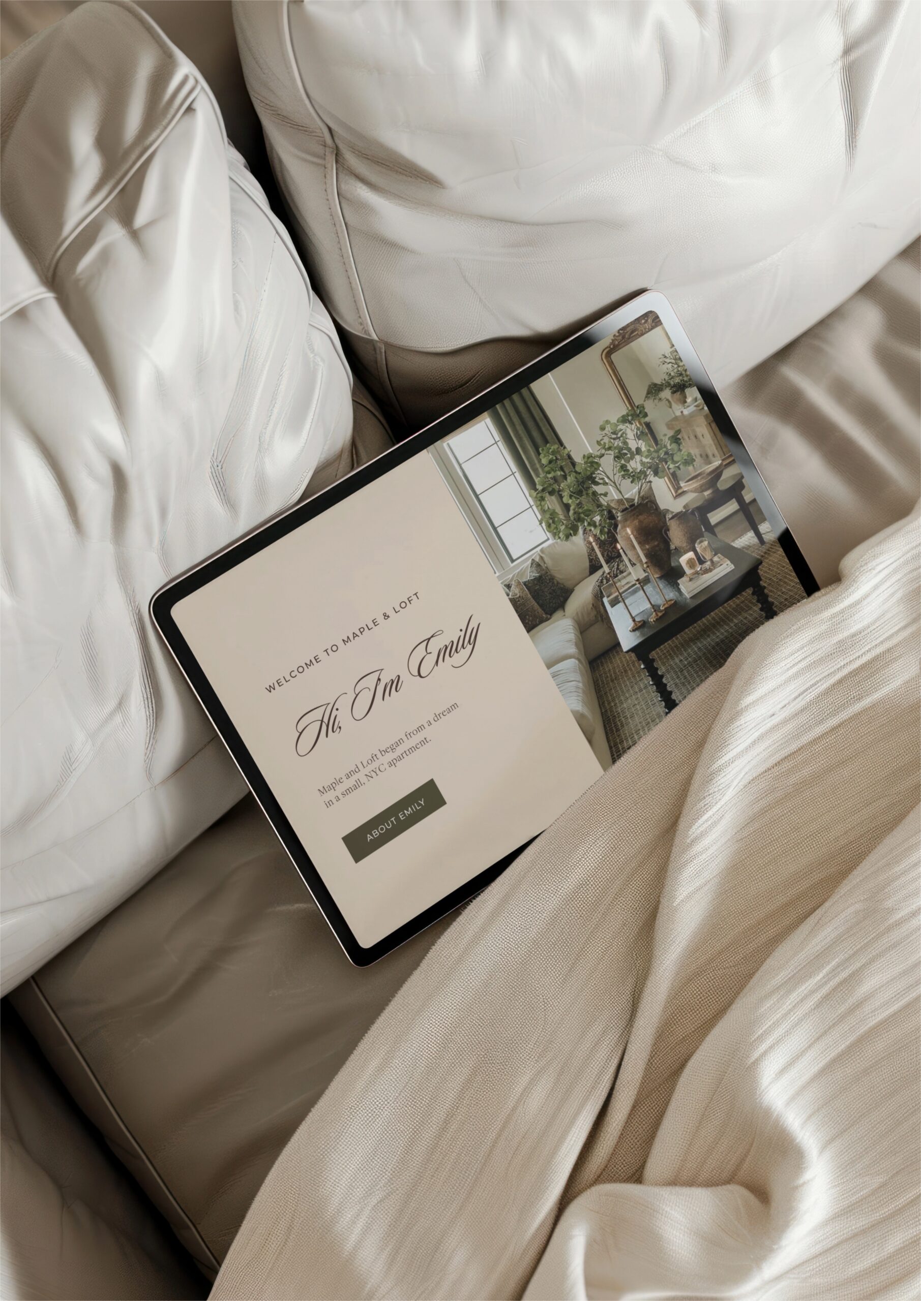
The primary logo, the arched alternate mark, the embossed treatment, the branded matchbox mockup… every item was designed to feel like it belongs in a space Emily would create! They’re classic, layered, and full of intentional detail.

The Photoshoot: Strategy Becoming Something We See
Brand photography can be a complex thing looking , but one thing I love to remind client’s about is that the photos aren’t the last step. When they’re done well, the photoshoot is the brand strategy in motion. It’s where all those abstract words like “elevated” and “approachable” become actual images you can use on your website, your Instagram, your inquiry page, your everything.
For Emily’s shoot, I built a detailed creative direction document and shot list weeks before we ever picked up a camera. Every setup, every outfit, every prop was mapped back to the brand strategy. Not in a rigid way (more on that in a second), but in a way that meant nothing was random.
We shot for three hours across a few locations: Emily’s apartment on the Upper West Side and the surrounding streets near 95th.


Inside the Apartment
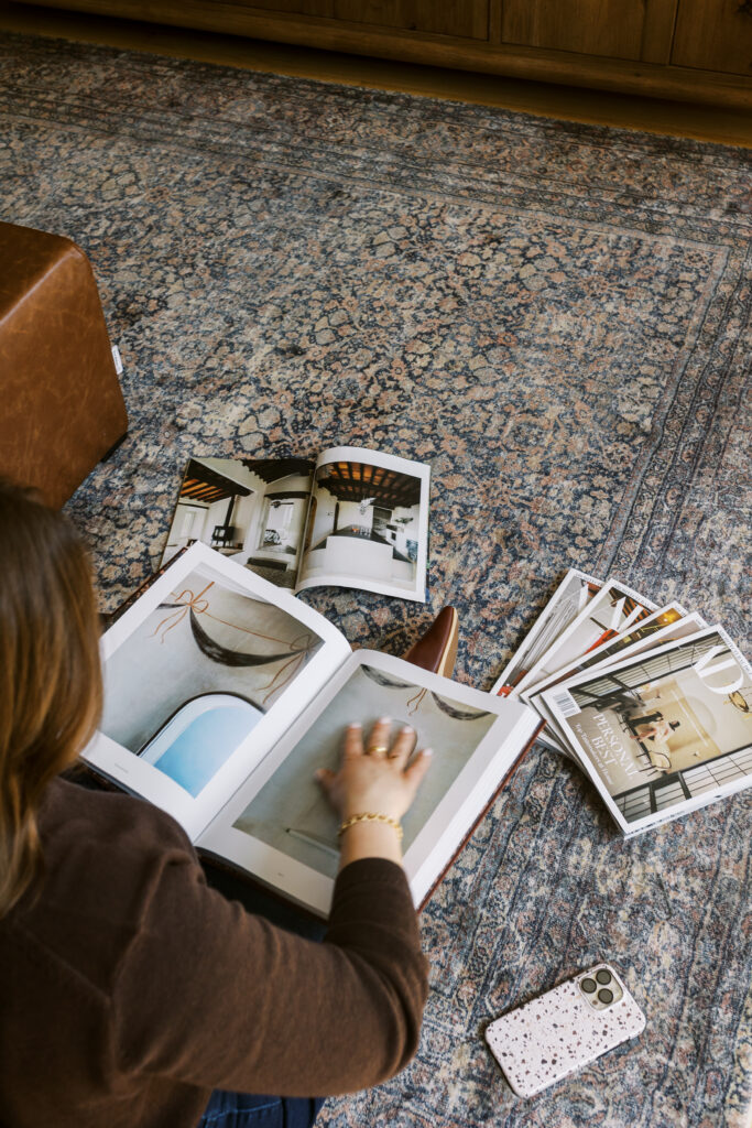
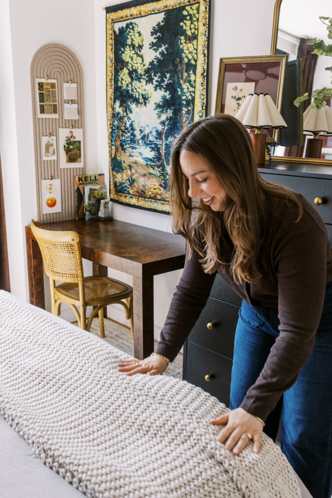
Emily’s apartment was the heartbeat of the shoot, for obvious reasons (I mean come on, it’s stunning). This is where Emily actually works, where she spreads fabric samples across the coffee table, flips through Architectural Digest for inspiration. We wanted these photos to show her real creative process!
We planned quite a few outfit changes to give her a range of content. The navy Madewell dress was our workhorse: professional but with a flowy, bohemian-meets-NYC quality that felt very on-brand. We shot her in the living room surrounded by swatches and moodboards, in the kitchen documenting a space she’d designed, and in the bedroom styling pillows and adjusting details.
The second outfit (a white eyelet ruffle top, very Anthropologie) shifted the energy toward client-facing moments. Working at her laptop with design mockups. Presenting samples. The kind of images that say “this is what it looks like when you hire me.”
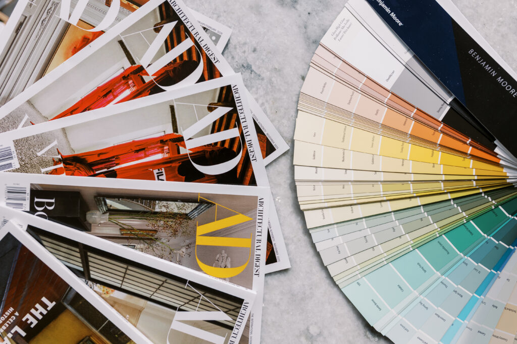
And now onto the detail shots (this is where the brand strategy really shows up). We styled flat lays with her actual tools of the trade: fabric samples, paint swatches, AD magazines, her tape measure, her branded Maple & Loft materials. We shot her custom cinnamon roll recipe card alongside design materials (yes, really, and YES to this, because it’s warm and homey and differentiates her from every other interior decorator’s brand photos). Her sweet dog Raleigh made a cameo, and the branded ML coffee mug showed up in lifestyle moments. Every single one of those details was planned. And every single one serves a purpose in her content library.


On the Outside
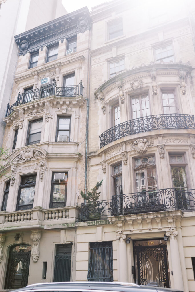
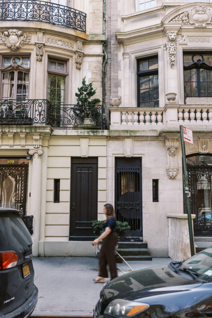
For the outdoor portion, we headed to the surrounding UWS streets, and this is where the brand story deepened. Emily is an NYC-based designer who draws genuine inspiration from architecture. She’s the person who looks up at building facades and notices the ironwork. So we shot her doing exactly that.
Walking down tree-lined streets past brownstones with wrought iron railings and carved stone details. Pausing on steps. Looking up at ornamental facades. Standing in front of ivy-covered buildings. The architectural details of the neighborhood became a visual extension of her design philosophy: classic, layered, beautiful in the details.
We chose specific blocks between Riverside Drive and Columbus for a mix of residential charm and the kind of old New York character that mirrors the Maple and Loft aesthetic. \


What Made This Shoot Work
Two major things went into the overall planning of this shoot –
First, the planning. I built a minute-by-minute timing breakdown, a full prop checklist (down to “charge laptop for digital mockups” and “print cinnamon roll recipe card”), outfit pairings with styling notes, and specific shot lists for every setup. Emily had a prep checklist weeks in advance, so we knew what we were walking into before we got there.
Second, the breathing room! For all that planning, I do love leaving space for creativity and breathing room. I intentionally left space for any spontaneous stuff happening – the candid laugh while flipping through a magazine, and the way Raleigh curled up on a chair in the background. A movement shot where the camera caught Emily mid-stride on the street, slightly blurry. These are the images that end up being someone’s favorites, and you can’t manufacture them so intently. But you can create the conditions for them to happen by getting the structured shots handled efficiently.
That balance (curated but not stiff, planned but not rigid) is really the whole ethos of this work. And it’s exactly what Emily brings to her clients’ spaces, too.

The Result
Emily now has a brand identity AND a content library that are speaking the same visual languages. The colors from her palette show up naturally in her photos. The warmth in the hand-drawn icons is echoed in the cinnamon roll flat lays and the styled bookshelves and the way she laughs mid-sentence. The NYC architectural shots feel like a visual continuation of the brand, not a separate thing bolted on.
She has images for her website hero, about page, Instagram grid, inquiry page, blog headers, and any “dead space” filler (the stuff you don’t think about until you need it). Emily has vertical AND horizontal crops. She now has headshots and full-length portraits and environmental shots and detail work. She has a full library of images, not just a headshot gallery.
And all of these images tell a strong story of a designer who makes beautiful, thoughtful spaces feel like home (cinnamon roll recipe included).
If This Is What You’re Looking For
This is what happens when brand design and brand photography are treated as one conversation instead of two separate ones. The strategy informs the visuals, and the visuals bring the strategy to life. And you get to walk away with a brand that doesn’t just look like you, but works like you and attracts the most aligned clients.
If you’re ready for a brand identity that goes beyond a logo and a color palette, one that includes the kind of intentional, story-driven imagery that actually fills your website and books your clients, I’d love to talk about what a full brand design package with a photography add-on could look like for your business.


Leave a Comment