


My sweet friends from Barefoot Material, Andy and Alexa, approached me with this idea to create a DIY and design brand for their blog + website. Immediately, I was on board. These two have a knack for all things creative and I knew they were going to excel at whatever they set their mind to.
Their website, Barefoot Material, launched only a few weeks ago, and to say I’m excited is the largest understatement, like ever. They already have a few DIY blog posts up and ready for your enjoyment, so head on over to their website and take a look for yourself!
Their Brand Story:
Andy and Alexa’s brand is a home improvement blog that empowers homeowners to create and cultivate their dream home and spaces. While we were at the drawing board with their first initial concepts, I wanted to make sure we kept the need for warmth and comfort while also capitalizing on the authenticity and creativity.
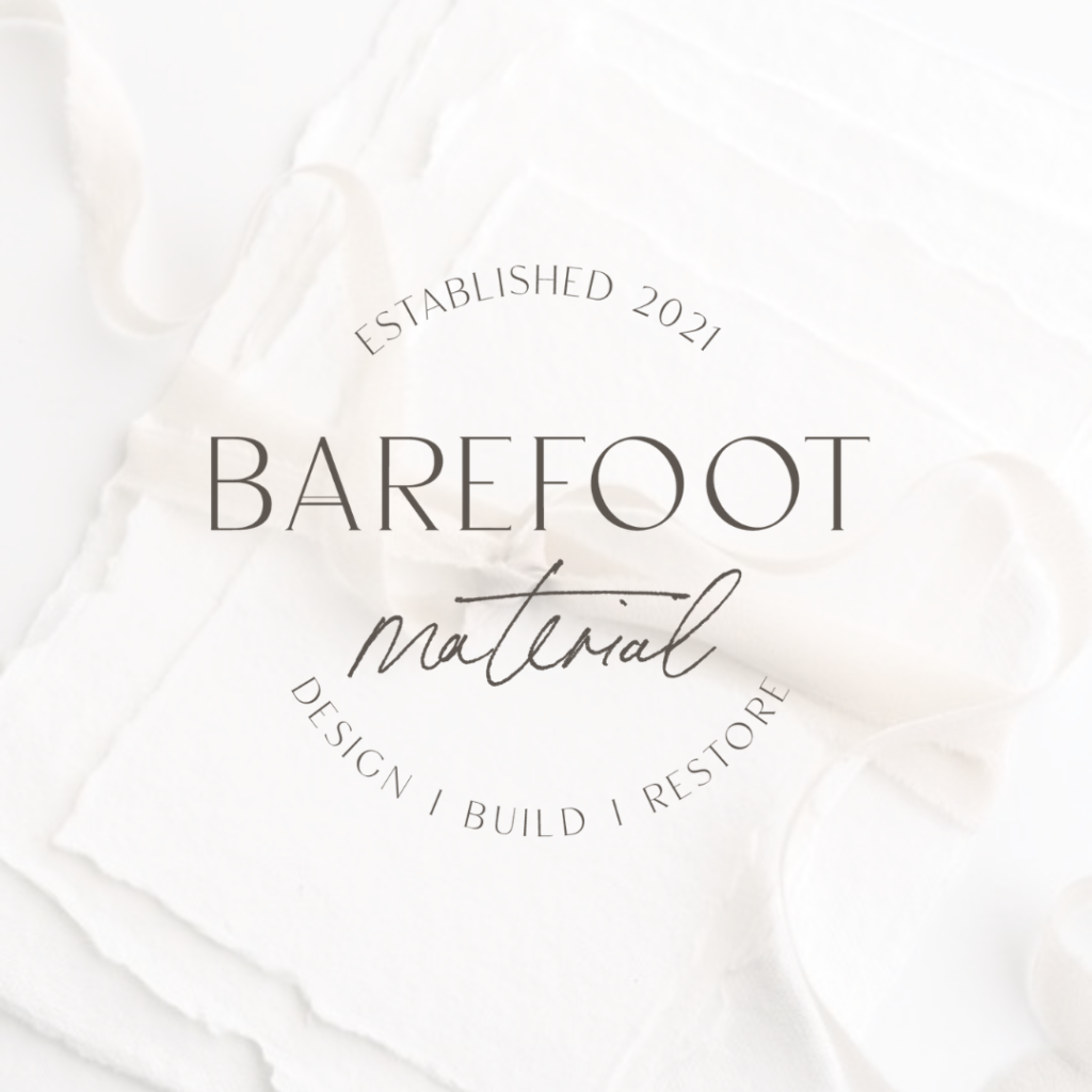
About Barefoot Material:
“Barefoot Material is a home improvement blog designed to inspire and instruct homeowners on how they can create the space of their dreams.”
Overall Brand Look + Feel:
“Sophisticated yet warm. We want to appear friendly and approachable but also credible and authentic. We’d like for our brand to reflect that we’re not afraid to get our hands dirty to deliver a quality, polished end product.”
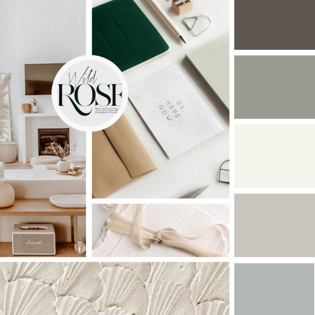
The Color Story Behind Barefoot Material:
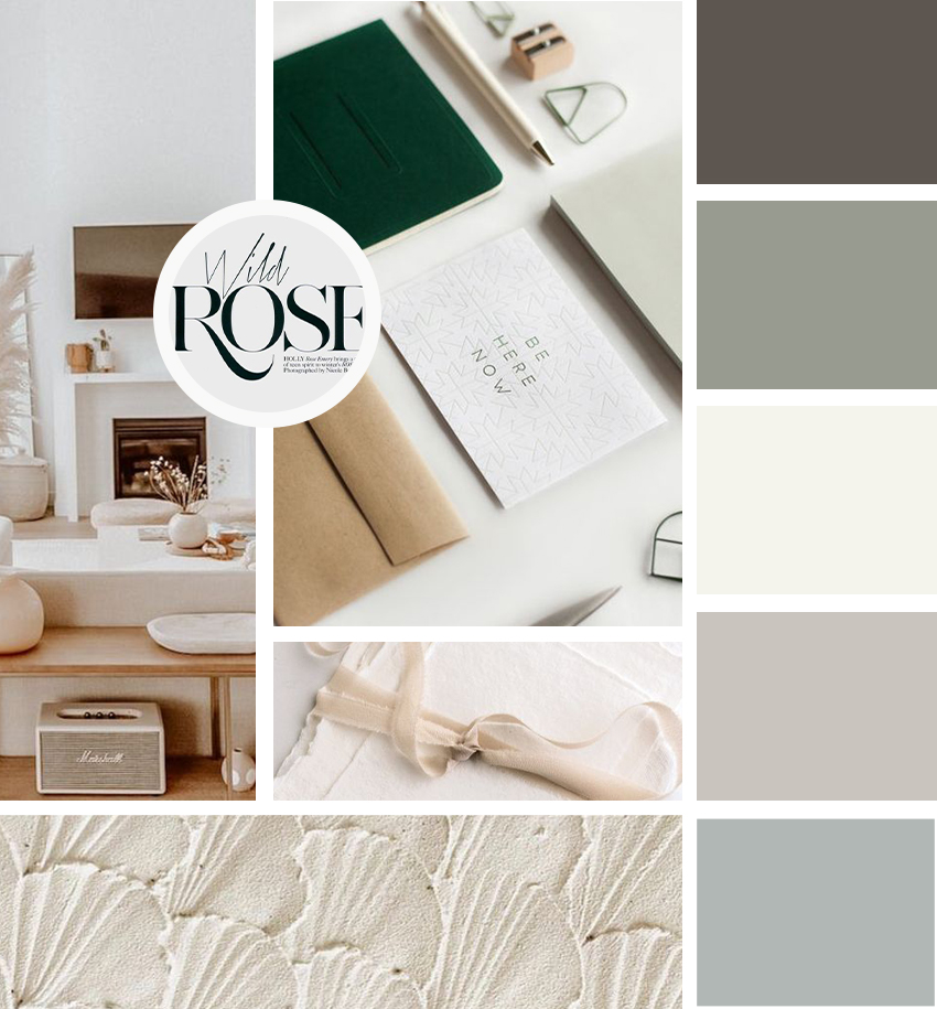
Andy and Alexa wanted warm tones with a sophisticated feel, so I added warm tones with a pop of cooler neutrals in their palette. I think the balance of the two darker tones along with the three neutral, warm-ish tones speaks volumes to their brand they’re created.
The Logo Creation:
Barefoot Material was SUCH a fun brand to create. I wanted to make Alexa and Andy’s brand completely unique, while also maintaining a familiarity and friendliness to blend with their color palette.
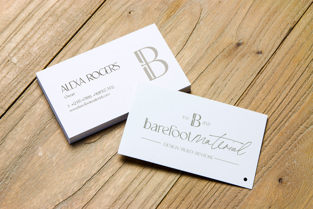
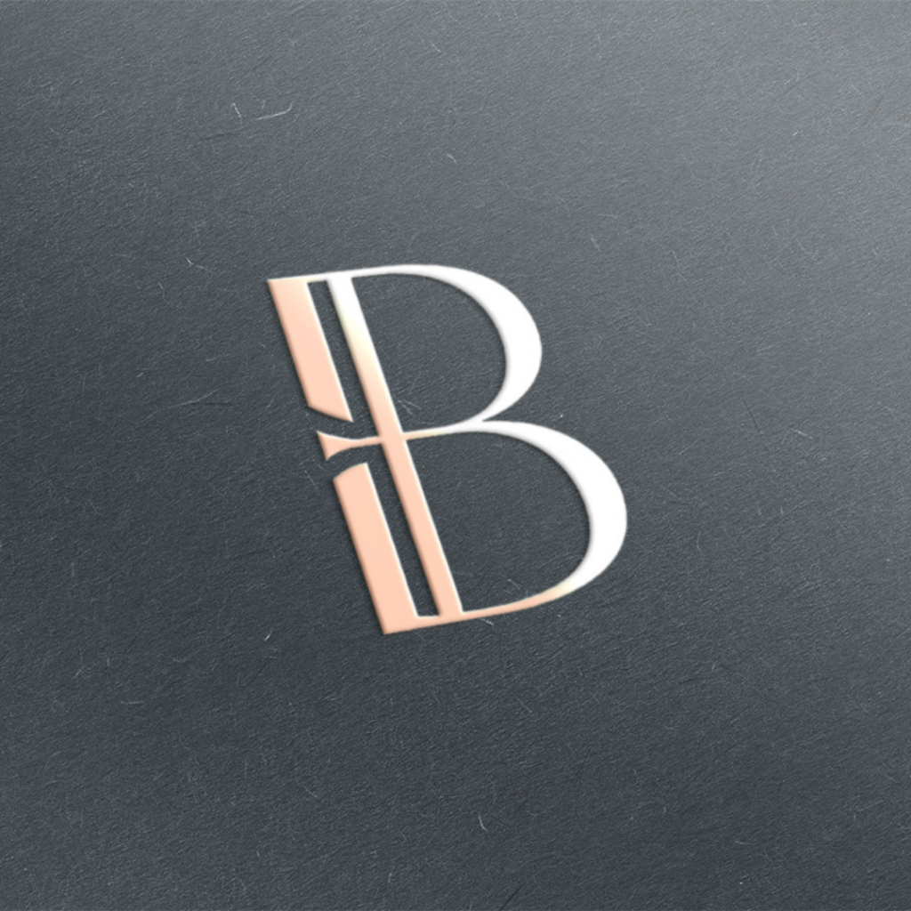
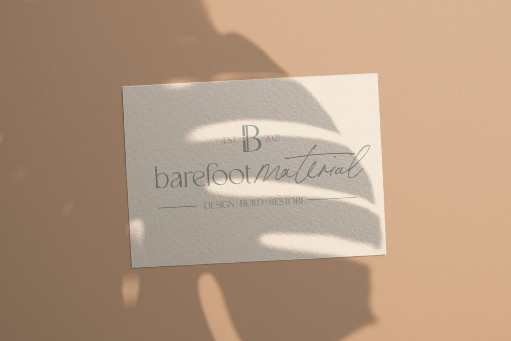
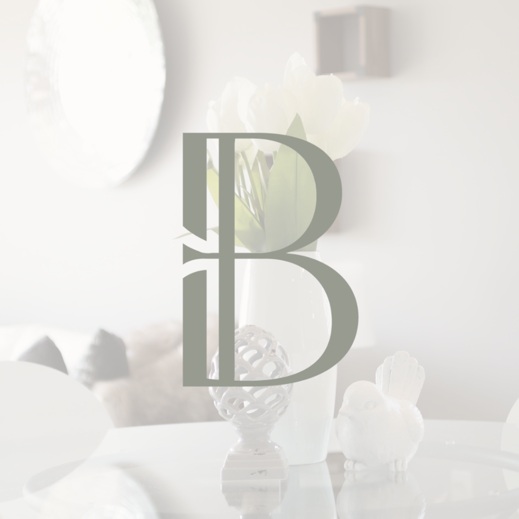
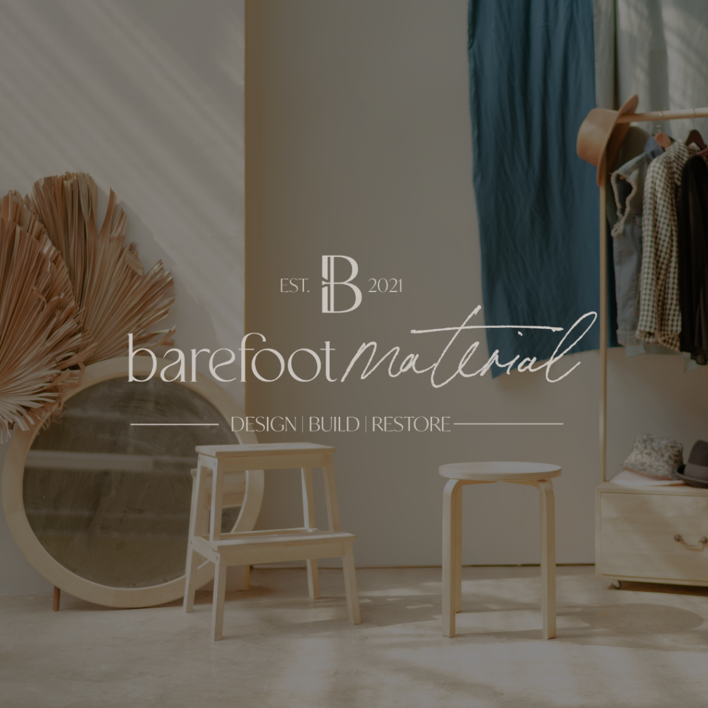
Their “B” icon is completely authentic and hand-drawn, adding to the authenticity element we are wanting to display right off the bat. The erased parts of the B were manufactured to create the illusion of beams within a home. In the main logo, the lowercase “b” was created with an additional “beam” to complement the icon of the brand.
The script font Bon Vivant was implemented to tie in the homey, DIY feel of the brand. Overall, the brand’s authenticity among the familiarity is complemented greatly.
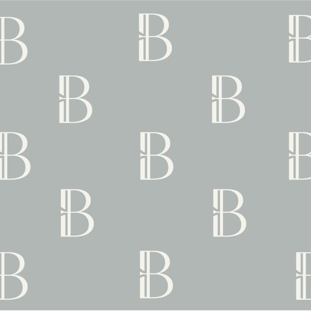
The circular alternative logo was one completely unique to the rest of the brand (and the alternative logo I’m obsessed with).
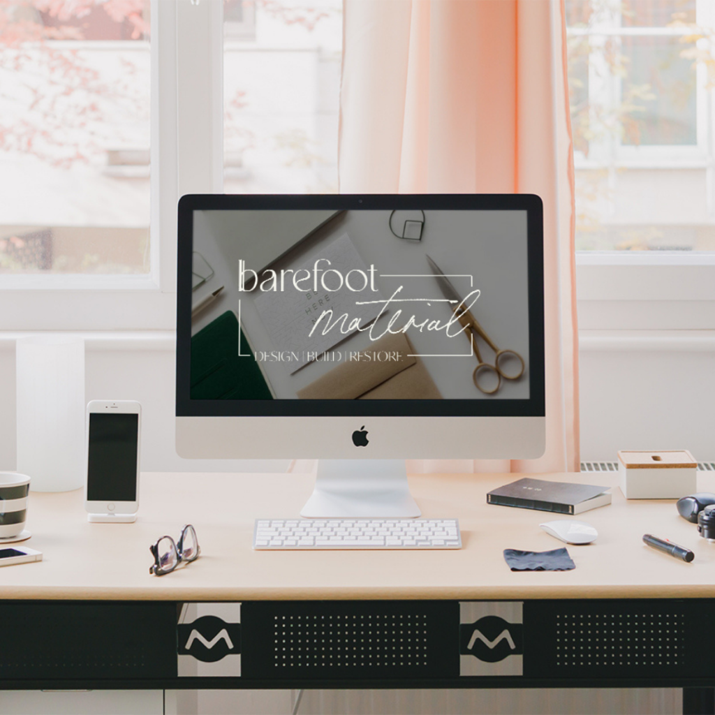
Take a look at their branding and logo designs below!


Leave a Comment