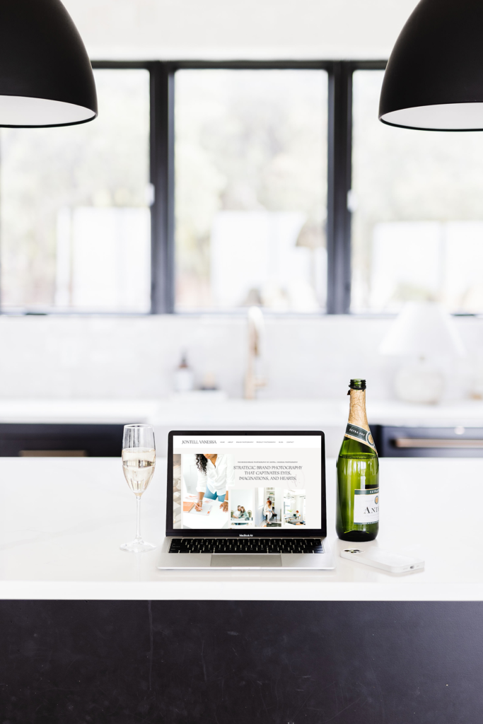
How to Choose Your Brand Color Palette
First, the best thing to do when first creating a color palette is begin your research (I know, obvious right?. For every client I take on, I create a separate (secret) Pinterest board and pin images based on their questionnaires. Taking images, logos, illustrations, and fonts, I create a mood board where I sample 5 different colors and create their dream brand color palette.
To get started, let’s ask ourselves these questions:
- What terms do you associate (or want to associate) with your brand? If you’re struggling with coming up with these terms, you may need to do some digging into your brand’s mission and values. Here’s a post on how to discover your brand values!
- What are your brand values? Try to associate your values with a color scheme.
- What colors do you like? What do you hate? Are there any colors that we don’t want associated with our brand?
Here are some more helpful color associations for basic colors:
- Red – bold, active, passionate
- Pink – feminine, romantic
- Orange – enthusiastic, playful, fun
- Yellow – happy, warm, cheerful
- Green – eco-friendly, fresh
- Blue – calming, trustworthy, peaceful
- Purple – royal, creative
- Black – classic, sophisticated, formal
- Brown – stable, earthy, rugged
*be warned, there are also some negative connotations with brands that are used – it’s up to you to do the research.
Here at Press and Palm, our brand colors are Blacks, Tans, and Shades of Grey. We want to exude professionalism, luxury, stability, warmth, and balance.
Tips when choosing your own color palette:
- Do your research
- More is not always better. Rather than busy your color palette up, there’s nothing wrong with white space and neutral/lighter tones and textures.
- Choose between 5-7 colors, any more than that can be confusing/busy-up the palette
- Whatever colors you do end up using, I think it’s fun to use different shades of those colors to add some dimension!
Resources for color palettes:
There IS a formula for creating a great color palette! Your brand colors should be around 5-7 total. This allows you to have plenty of colors for any situation while still maintaining consistency and brand recognition.
Creating your brand color palette
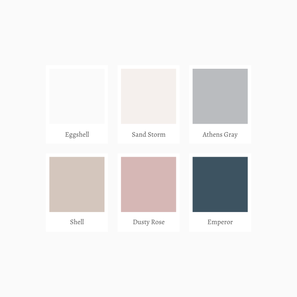
The equation: 2 Main Colors + 3 Neutrals +
2 Main Colors
I always choose one main bold(ish) color and then a color that compliments it. These will be your two main brand colors that will create brand recognition. I’m a HUGE fan of neutrals and lighter tones, so the “bold” color for me is usually a darker color.
Bold/Bright Primary Color – Pick a bold or bright color that you love and that represents your brand’s mission/values (think back to those three adjectives you thought of that describes your brand). This color will be used for grabbing attention, highlighting important information, and used for calls to action. This color should be memorable so I suggest picking this one first.
Complimentary Color– Next pick a color that contrasts and compliments the bold color. It can be useful to use the color wheel for picking a complementary color. I like to use Adobe Color.
2-3 Neutral Colors
Accent Neutral – Next pick a neutral shade that pairs well with your bold and complimentary color. This helps ground your colors and you can use them as an accent color.
1 Dark Neutral – Pick a dark neutral color that aligns with the rest of your color scheme. We’re going to use this color mostly as a text color. My go-to is always a slate gray.
1 Light Neutral – Pick a light neutral color. We’re using this color as a background and for supporting elements, like buttons. This color is not going to take the limelight whatsoever, but it is SO useful because it adds depth to the brand palette.
If you liked this, then you’ll love:
Things to Know Before DIYing Your Brand





[…] Creating Your Perfect Brand Color Palette […]
[…] The Anatomy of a Brand Color Palette […]
[…] Creating Your Perfect Brand Color Palette […]