


Welcome to Part 6 of the Brand Strategy Summer Series! This 8-part series dives into the processes behind my Brand Strategy sessions with clients while also giving you bite-sized, actionable tips to dive into your own brand. After following along on this 8-part series, you’ll have a totally new internal and external identity by the end of the summer.
If you missed Parts 1-5 from the Brand Strategy Summer Series, you can access those past blogs below.
Part 1: Brand Foundations
Part 2: Finding and Understanding Your Audience
Part 3: Mastering the Art of Positioning
Part 4: Crafting a Captivating Brand Voice
Part 5: Designing a Mood Board Connected to Your Brand Identity
Part 6 of The Brand Strategy Series is all about using color psychology within your branding
The color selection process may seem arbitrary when it comes to branding, but I have a theory that people are more drawn to brands because of the fonts/colors than we think they are. In this modern world of marketing, when anyone can create a business and slap a color palette together, I deem the color psychology piece as essential for the brand design process and therefore prioritize this when working with clients!
Let’s head back to the Pinterest boards you created in Part 5, yeah? Taking the mood board you created, it’s time to start sampling colors from that document. I like to aim for as many as up to 10 colors initially and then pair down from there.
Another initial step to complete is really acknowledging what colors you like, what colors you hate, and. if there are there any colors that you don’t want associated with your brand. I am also. afirm believer that there is no use for a color palette if YOU (the person running this business) isn’t a fan of it. It has to be the perfect combination of personal preference backed by color psychology.
Colors hold incredible power. By understanding even a little bit behind color psychology, you can create a brand that deeply resonates with your audience, stirs emotions, and leaves a lasting impression. Combined with all of your other brand strategy work, the visual piece will really hit home with your audience. Let’s dive into the importance of color psychology and how it can supercharge your brand’s impact.
Choosing Colors Based on Emotions
Colors have the ability to evoke emotions and influence behavior. Color psychology itself helps us understand how different hues and shades impact our thoughts and feelings. By choosing the right colors for your brand, you can forge a strong connection with your audience and express your brand’s personality and values effectively!
Here are some more helpful color associations for basic colors:
- Red – bold, active, passionate
- Pink – feminine, romantic
- Orange – enthusiastic, playful, fun
- Yellow – happy, warm, cheerful
- Green – eco-friendly, fresh
- Blue – calming, trustworthy, peaceful
- Purple – royal, creative
- Black – classic, sophisticated, formal
- Brown – stable, earthy, rugged
*be warned, there are also some negative connotations with brands that are used – it’s up to you to do the research.
Here at Press and Palm, I really wanted our brand colors to emulate professionalism, luxury, warmth, and balance. THOSE are my main core values, and all of our brand colors (blacks, tans, and shades of gray) reflect those values inside of their color psychology meaning.
Things to remember when selecting the colors for your brand’s identity:
- More is not always better. Rather than busy your color palette up, there’s nothing wrong with white space and neutral/lighter tones and textures.
- Choose between 5-7 colors, any more than that can be confusing/busy-up the palette
- Do your research on what the colors mean
- Whatever colors you do end up using, I think it’s fun to use different shades of those colors to add some dimension!
Resources for color palettes:
There IS a formula for creating a great color palette! Your brand colors should be around 5-7 total. This allows you to have plenty of colors for any situation while still maintaining consistency and brand recognition.
Creating your brand color palette
The equation: 2 Main Colors + 3 Neutrals = the perfect amount of colors to choose from
See? It’s pretty simple when you view it from that perspective.
Choosing Your 2 Main Brand Colors
Now there isn’t a harsh formula to follow for this part (and you have so much freedom to choose your color palette however that may look). BUT I always like choose one main bold or bright(ish) color and then a lighter color that compliments it. These will be your two main brand colors that will create brand recognition. I’m a HUGE fan of neutrals and lighter tones, so the “bold” color for me is usually a darker color.
Bold/Bright Primary Color – Pick a bold or bright color that you love and that represents your brand’s mission/values. This color will be used for grabbing attention, highlighting important information, and used for calls to action. This color should be memorable so I suggest picking this one first.
Complimentary Color– Next pick a color that contrasts and compliments the bold color. It can be useful to use the color wheel for picking a complementary color (a color that is across from yours on the color wheel). I like to use Adobe Color.
Choosing the rest of your color palette
Accent Neutral – Next pick a neutral shade that pairs well with your bold and complimentary color. This helps ground your colors and you can use them as an accent color.
1 Dark Neutral – Pick a dark neutral color that aligns with the rest of your color scheme. We’re going to use this color mostly as a text color. My go-to is always a slate gray.
1 Light Neutral – Pick a light neutral color. We’re using this color as a background and for supporting elements, like buttons. This color is not going to take the limelight whatsoever, but it is SO useful because it adds depth to the brand palette.
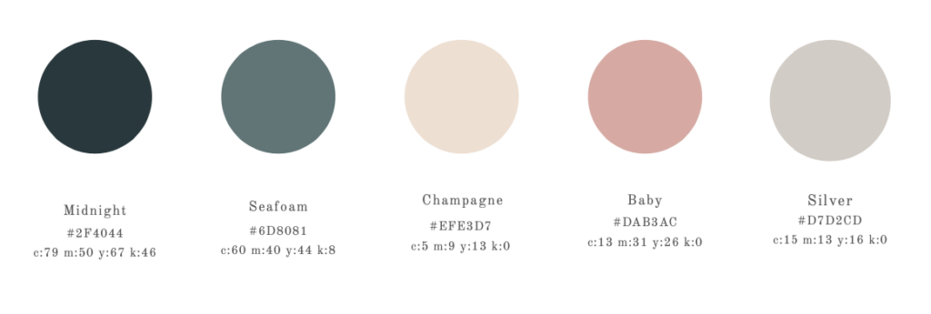
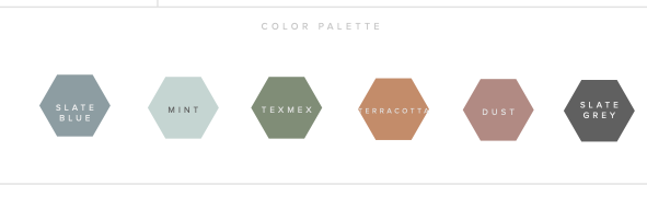
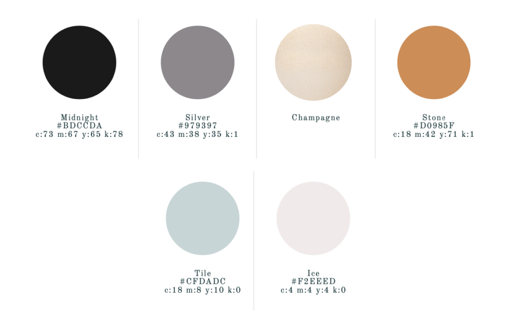
Below are some color palette examples for past client’s that I’ve created using this formula.

By understanding how color psychology in brand design can influence emotions and associations, you can create a brand that resonates with your audience on a deeper level. Consistent use of colors strengthens your brand identity, while unique choices help you stand out from the competition. Consider color psychology in your brand strategy, and watch as your brand captivates hearts and leaves a lasting impact.


Leave a Comment