


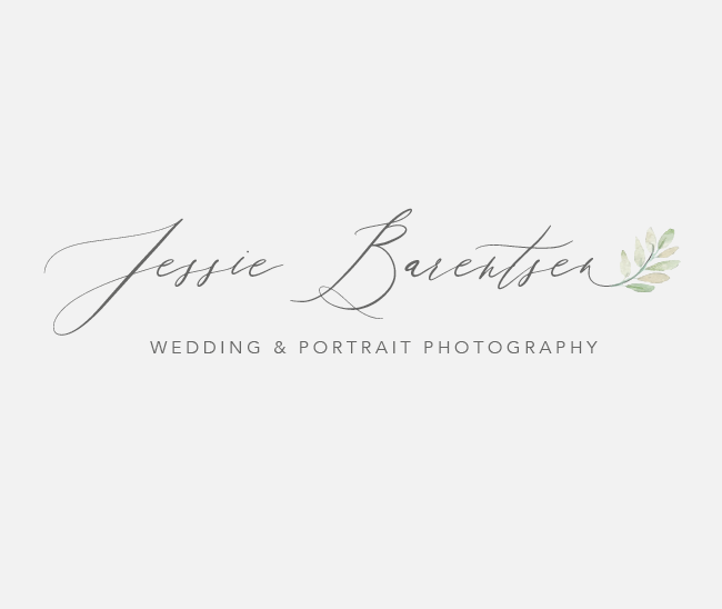
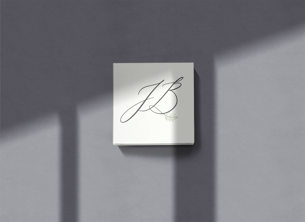
Jessie Barentsen Photography
Being a wedding and portrait photographer, Jessie and I had such a great connection to start out with! Her love of neutrals and light colors also made my heart so happy. My wedding photography and editing style is a light + bright vibe, meaning my design style is a similar way!
About Jessie Barentsen Photography:
If I would describe my vision on my company, I would say it would be a company that makes people smile, and where they feel special and beautiful. I have a very romantic style and taste, with soft colors, light but colorful. I love flowers, spring, the sun, blue, white and pink, trees and the beach. When people see my images, I want them to feel joy, romance, love, a fairytale.
What emotions do you want your brand to exude: (ex. joyful, expensive, calm, loud etc.)
Romantic, genuine, love, having fun, true laughter, sophisticated, dreamy.
Color story: (what colors are you drawn to? or not drawn to?)
White, pink, light blue, light grey. No yellow/brown/orange tones, red tones, purples, black. It needs to be fresh and clean. I want it to be simple but classic, not too modern.

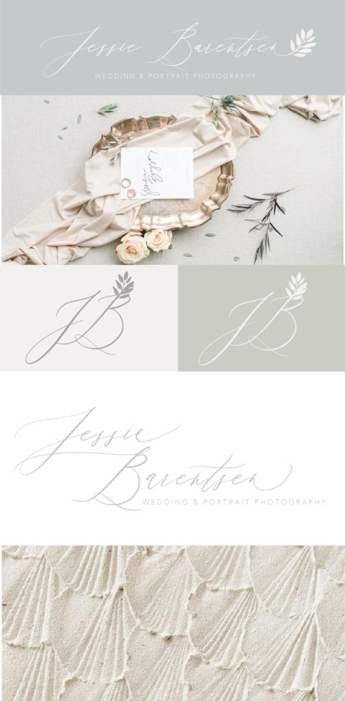


[…] Jessie Barentsen Photography Branding […]
[…] Jessie Barentsen Photography […]